
Color-critical work gets frustrating fast when a screen drifts, blacks crush detail, or the stand fights your desk setup. You want a monitor that keeps skin tones, product shots, timelines, and layouts steady without making setup feel like a chore. These seven picks cover compact 24-inch panels, wide 27-inch options, and a 34-inch ultrawide, so you can match the screen to your desk and your workload. The trade-offs matter too, since sharper color usually comes with a higher price, a larger footprint, or fewer gaming-style extras.
The Shortlist At A Glance

ASUS ProArt PA247CV 24 Inch 1080p USB-C Monitor

ASUS ProArt PA279CRV 27 Inch 4K UHD USB-C HDR Monitor for Mac

Dell 34 Monitor S3425DW, WQHD VA, 120Hz, FreeSync Premium, Eye Comfort

ViewSonic VP3256-4K 32 Inch 4K ColorPro Monitor

LG 27UP650K-W 27-inch Ultrafine 4K UHD IPS Monitor
ASUS ProArt PA248QFV 24 Inch WUXGA 16:10 Professional Monitor
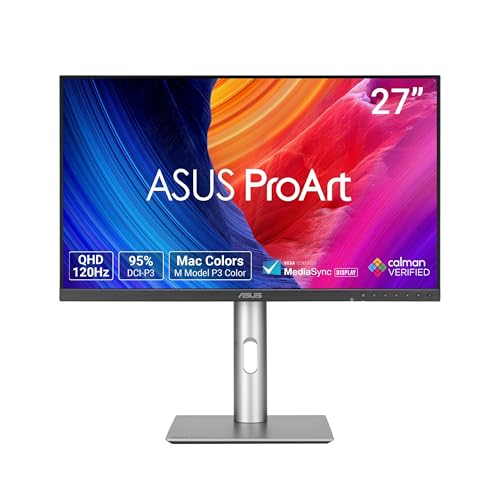
ASUS ProArt PA278QGV 27 Inch 1440p QHD Professional Monitor
More Details On Our Top Picks
Desk space matters just as much as color accuracy for a lot of home setups, and this 24-inch ProArt keeps both in view. The 1080p panel is easier to drive than a 4K screen, so it suits laptops, office PCs, and modest editing rigs without much fuss.
The USB-C port with 65W power delivery helps cut cable clutter, which is handy on a daily work station or a side-by-side dual-monitor layout. You give up some pixel density compared with the 4K ProArt models later in this list, but the smaller footprint makes the trade easier to live with.
Strong Points
- Calman verification and factory tuning help keep color work steady right out of the box.
- USB-C with 65W power delivery simplifies a laptop desk and reduces cable mess.
- Daisy-chain support suits dual-screen setups that need fewer cables running across the desk.
- Ergonomic stand adjustment helps you set a better viewing angle in a shared office.
Things To Consider
- 1080p on 24 inches is practical, though finer text and image detail will look less crisp than on the 4K picks.
- The smaller screen can feel tight for timeline-heavy editing or large spreadsheet work.
- USB-C convenience depends on a compatible laptop port, so some desktop setups may use HDMI instead.
Feature Rundown
Who It Suits Best
You’ll get the most from this model in a compact home office, a student workspace, or a simple creative station where a 24-inch screen feels just right.
A Better Fit Elsewhere
ASUS ProArt PA279CRV is the better match for you if 4K detail and wider color coverage matter more than keeping the desk compact.
This 27-inch 4K ASUS feels built for detailed grading, photo retouching, and any desktop where tiny type needs to stay clean. The wider workspace gives you more room than the PA247CV, and the 96W USB-C connection can handle a modern laptop with fewer cables on the desk.
The 99% DCI-P3 and 99% Adobe RGB figures matter most for color-managed work, since they point to broad gamut support in the spaces many creative apps lean on. The honest read is that this is more monitor than casual office work needs, but for Mac-based studios or serious content workflows, that extra headroom is the point.
What We Like
- 4K resolution on 27 inches gives you sharper text and more room for tools.
- Wide DCI-P3 and Adobe RGB coverage suits photo and video work that depends on faithful color handling.
- USB-C with 96W power delivery can reduce dock clutter for laptop-based setups.
- Calman verification and Delta E under 2 support a more reliable starting point for color work.
- Height adjustment helps match the screen to a comfortable eye line during long sessions.
Worth Noting
- The feature set pushes it toward pro use, so it can feel more than you need for basic email and browsing.
- 4K scaling on macOS and Windows takes a little setup attention for clean text sizing.
- The larger panel needs more desk depth than the 24-inch ASUS model.
Technical Sheet
Made For
Professional editors and photographers will appreciate the combination of 4K detail, wide gamut support, and single-cable laptop setup.
Look Elsewhere When
ASUS ProArt PA247CV makes more sense for a tighter desk or a lighter workload that does not need 4K density.
The Dell 34 shifts the focus from pure color work to a broader day-to-day setup, and that makes sense for people who edit, browse, and game on the same desk. The curved 34-inch format gives your windows room to breathe, while the VA panel, or vertical alignment panel, is tuned for stronger contrast than many basic IPS office screens.
Compared with the ASUS ProArt options, this one is less about studio-grade gamut coverage and more about comfort, motion, and a roomy workspace. The 120Hz refresh rate, FreeSync Premium, and built-in speakers make it feel friendlier for mixed-use setups, though the ultrawide shape can be overkill in narrow workspaces.
Upsides
- Ultrawide 34-inch layout makes room for side-by-side apps without a second panel.
- 120Hz refresh rate gives smoother cursor movement and nicer motion in games and video.
- USB-C with 65W power delivery supports simple laptop docking.
- Built-in speakers reduce the need for extra desk hardware in modest setups.
- Eye comfort features suit long office sessions where you stare at the screen for hours.
Room For Improvement
- It is less focused on color-critical branding and print work than the ProArt and ColorPro models.
- The curved ultrawide shape can take some getting used to for straight-line design tasks.
- Desk depth matters, since a 34-inch panel can feel large on shallow tables.
Feature Snapshot
Right Fit For
Desk-bound multitaskers who want a wide screen for work and a little gaming on the side will get the most out of this Dell.
Another Choice May Suit
ViewSonic VP3256-4K is the better call for creators who want a larger flat panel with a stronger color-first focus.
The VP3256-4K leans into a larger 32-inch canvas, which can feel like a proper workspace for photo editing, layout work, and large documents. The three-sided frameless design keeps the view tidy, and the IPS panel helps the image stay consistent across wider viewing angles.
Compared with the Dell 34, this one trades motion extras for a more traditional color-first setup. The 100% sRGB coverage and Pantone validation matter most when you want your screen to stay dependable for digital design, though the 60W USB-C connection is more modest than the power delivery on the two ASUS ProArt picks.
Reasons To Buy
- 32-inch 4K size gives you plenty of room for creative tools and reference panels.
- IPS viewing behavior helps the picture stay steady from a variety of seating positions.
- 100% sRGB coverage fits web graphics, digital art, and general studio work.
- Pantone validation appeals to people who want a more controlled color workflow.
- USB-C, HDMI, and DisplayPort inputs make it easy to connect different systems.
Softer Spots
- The 60W USB-C port is useful, though it may not be enough for every high-power laptop.
- Its large footprint asks for a deeper desk than the 24-inch monitors in this list.
- 60Hz refresh is fine for design work, but less exciting for fast motion and gaming.
Details At A Glance
Whose Shelf It Belongs On
Graphic designers and content teams who want a large, steady work panel will appreciate what this ViewSonic brings to the desk.
Swap It Out When
ASUS ProArt PA279CRV is the smarter choice for you if 4K sharpness and broader gamut coverage sit higher on your list.
The LG 27UP650K-W sits in a very practical middle ground, especially for you if you want 4K clarity without a giant chassis on the desk. The white finish gives it a lighter look than the black ProArt models, and the tilt, height, and pivot adjustments make it easier to fit into a shared office or dorm setup.
Reader Mode and Flicker Safe point toward more comfortable long sessions, which helps when your day alternates between documents, browser tabs, and creative work. The honest read is that it stays more mainstream than the ASUS pro-calibration crowd, but that also makes it less fussy for everyday use.
Best Bits
- 4K resolution on 27 inches gives a crisp workspace for text and visuals.
- IPS panel keeps colors consistent across normal seated viewing positions.
- Reader Mode and Flicker Safe support longer office sessions with less strain from distracting screen behavior.
- Tilt, height, and pivot adjustment make it easier to align the display to your chair and desk.
- DisplayHDR 400 adds a little extra punch for supported content.
Points To Note
- 60Hz is fine for office work, though faster motion fans will notice the ceiling quickly.
- The white finish is distinctive, but it can show dust more readily than darker shells.
- It lacks the broader pro-gamut focus of the higher-end ASUS and ViewSonic models.
Core Details
Best Suited To
You will like this LG most in a home office or student setup where 4K sharpness and simple comfort features matter more than pro color extras.
Where A Sibling Pick Shines
ASUS ProArt PA248QFV suits you better if you want a taller 16:10 workspace for documents and editing panels.
The PA248QFV stands out for the tall 16:10 shape, which gives you extra vertical room for toolbars, scripts, and document pages. That extra column of space can feel like a small gift in editing apps or office work, because you scroll less and keep more of the layout visible.
It also adds 100Hz support, so the desktop feels smoother than the 60Hz models in this roundup. Compared with the earlier 24-inch PA247CV, this one is better suited to people who value a taller work area and a bit more motion fluidity, though the 1920 x 1200 resolution still stops short of the 4K detail found on the larger ASUS models.
Highlights
- 16:10 aspect ratio gives extra vertical space for timelines, code, and documents.
- 100Hz refresh rate makes cursor movement and scrolling feel smoother than standard office panels.
- Calman verification and Delta E under 2 support consistent color starting conditions.
- 100% sRGB helps common digital work stay within a familiar color range.
- Built-in USB hub and multiple inputs make desk organization easier.
Minor Gripes
- 1920 x 1200 is useful, though it does not deliver the detail density of 4K options.
- The 24-inch size is compact, so large creative layouts can feel crowded.
- Mac users who want a wider color gamut may prefer the PA279CRV instead.
At A Glance
Who Will Love This
Writers, developers, and editors who want a compact monitor with extra vertical room will feel right at home here.
Skip It When
ASUS ProArt PA279CRV fits better for you if 4K resolution and broader color space matter more than vertical workspace.
The PA278QGV lands in a very appealing middle lane, since 27-inch QHD feels easier to drive than 4K while still looking sharper than 1080p. That makes it a strong match for mixed creative work, especially in a studio where you want fast-feeling navigation without giving up careful color control.
It carries the same ProArt DNA as the other ASUS panels here, but the 120Hz refresh rate and 95% DCI-P3 coverage push it toward a more flexible daily driver. The catch is that QHD is still a step below the 4K models for ultra-fine detail, yet many people will find that trade easier on both the graphics card and the wallet.
Bright Spots
- QHD resolution keeps the workload lighter than 4K while still looking sharp on 27 inches.
- 120Hz support makes scrolling, dragging, and general desktop motion feel fluid.
- 95% DCI-P3 suits wider-gamut creative work better than basic sRGB-only panels.
- Calman verification and Delta E under 2 support dependable color starting points.
- USB hub and video inputs help simplify a multi-device desk.
Areas To Watch
- QHD is a sensible middle ground, though it lacks the extra crispness of 4K.
- Color coverage is broad, but not as wide as the PA279CRV’s DCI-P3 and Adobe RGB mix.
- Creative users who want a taller workspace may prefer the PA248QFV’s 16:10 layout.
Quick Facts
The Right Fit
You will get the best value from this ASUS if you want a responsive 27-inch screen that handles both creative work and daily use without the heavier demands of 4K.
Where A Sibling Pick Shines
ViewSonic VP3256-4K is the better match for you if a larger 4K workspace matters more than speed and balance.
How To Choose The Right Color Accurate Monitors
Start With The Work You Actually Do
Color accuracy matters differently for a photo editor, a video cutter, and someone who lives in spreadsheets all day. A monitor with Calman verification, Delta E under 2, or wide-gamut coverage makes the most sense when your work depends on stable tone and consistent output. For routine office use, that same money can go farther in a brighter stand, a larger panel, or USB-C power delivery.
Screen size and resolution should work together, not fight each other. A 24-inch 1080p display is easy to place and easy to run, while 27-inch 4K screens give you denser detail for images and text. A 32-inch 4K panel spreads out tools nicely, though it asks for more desk space and a more serious graphics setup.
Match The Panel To Your Desk And Devices
IPS panels keep viewing angles steadier, which helps when you lean back, share the screen, or move through a long editing day. VA panels usually lean into contrast and can feel better for mixed media and dark scenes, while ultrawide curved layouts are better for multitasking than precise color drafting. None of that is magic, it just changes the kind of work the display handles comfortably.
USB-C is worth paying attention to because it can carry video and power through one cable. Lower wattage works for lighter laptops, while 96W or similar higher delivery makes more sense for heavier machines that stay on the desk. HDMI and DisplayPort still matter too, especially when your desktop and laptop both need easy connection options.
Look At Calibration, Not Just Marketing
Factory calibration and validated color targets help narrow the gap between what you see and what you need to deliver. sRGB remains the safer fit for web graphics and general digital work, while DCI-P3 and Adobe RGB become more useful for film, motion, and print-adjacent projects. The bigger the color space, the more likely the monitor is built for serious creative work rather than casual use.
Refresh rate is the last detail many people miss. A 60Hz panel is fine for still work, but 100Hz or 120Hz can make the desktop feel smoother during scrolling and timeline work. That extra fluidity does not replace good color, yet it can make long sessions feel easier.
Things Worth Knowing First
Common Shopping Slip Ups
One common mistake is buying a wide-gamut screen for simple office work, then never using the extra range. Another is picking a sharp 4K panel without checking desk depth, since the stand and viewing distance can matter as much as the resolution. You can dodge both by matching panel size, color space, and connection type to your actual desk setup.
Another trap is ignoring ergonomics until your neck complains. Height, tilt, pivot, and stand stability matter in a real workspace, especially for long sessions. A monitor with modest specs but a good stand often feels better day after day than a prettier box with awkward positioning.
What The Higher Tier Buys
Higher-priced color monitors usually spend the extra money on factory tuning, broader gamut coverage, better stands, and stronger connectivity. That matters most for studio work, client-facing design, and print-sensitive tasks where color drift becomes annoying fast. You are not just paying for pixels, you are paying for fewer second guesses.
The upgrade is worth it when your screen sits at the center of paid creative work. For casual browsing, school papers, or mixed home use, a well-chosen midrange panel often makes more sense. For editing, grading, or design review, the better panel and cleaner connectivity can save time every week.
Frequently Asked Questions
What makes a monitor color accurate?
A color accurate monitor aims to show tones more consistently across the screen and across different sessions. Factory calibration, Delta E targets, and wide-gamut support all help with that goal.
Is 4K always better for color work?
4K helps with detail, but it does not automatically make colors better. You still want solid calibration, the right gamut, and a size that fits your desk.
Do you need USB-C on a creative monitor?
USB-C is not required, but it can simplify a laptop setup by carrying video and power through one cable. That is especially handy on compact desks or mobile workstations.
Is 120Hz useful for design work?
It can make scrolling, dragging, and window movement feel smoother. It does not replace accurate color, but it can improve daily comfort.
Which color space matters most for web work?
sRGB is the safest starting point for web-focused design and general screen content. DCI-P3 and Adobe RGB become more relevant when your work leans toward video or print.
